Dropdown
Inherits from Editable Control.
Properties:
ItemsSource
Specifies the name of the List that contains the items that is displayed to the user, or a binding to a collection in the Form Runtime.
Example
This example shows how to set the ItemSource of a Dropdown, and data bind its selected value to the EmployeeID field of the Customer model.
    <Data>
        <Models>
            <Model Name="Customer"
                Source="Customer"
                Fields="Name, Address, SalesRepID"
                Filter="ID = @ID">
            </Model>
        </Models>
        <Lists>
            <List Name="SalesReps"
            Source="Employees"
            Fields="EmployeeID, Name"
            Filter="Title = 'SalesRep'"/>
        </Lists>
    </Data>
    …
    <Dropdown Name="customerSalesRep" ItemsSource="SalesReps" SelectedValue="{Binding Path:Customer.SalesRepID}" DisplayMember="Name" ValueMember="EmployeeID"/>
ItemsSourceFilter
Optional. Specifies a function that returns the items to render in the Dropdown. The function cannot be asynchronous.
Example
<Form>
  <Data>
    <Models>
      <Model Name="Customer" Source="@Object[Customers].DbObjectName" Fields="ID,Name" />
    </Models>
    <Lists>
    	<List Name="Customers" Source="@Object[Customers].DbObjectName" Fields="ID,Name"/>
    </Lists>
  </Data>
  <Functions>
  	<Function Name="MyFilter" Parameters="items, controlName">
  		return items.filter(item => item.ID !== "Customer1");
  	</Function>
  </Functions>
  <UI Grid="ui-root">
    <Dropdown Row="1"
    	MinWidth="100px"
        ItemsSource="Customers"
        ItemsSourceFilter="MyFilter($Data, $Ctrl.Id)"
    	DisplayMember="Name"
    	ValueMember="ID"
    	SelectedValue="{Binding Path:Customer.ID}" />
  </UI>
</Form>
DisplayMember
Specifies the field of the List that is displayed to the user. This is usually a description or some sort of user friendly text.
ValueMember
Specifies the field of the List that holds the actual value. This is usually an ID of some sort.
SelectedValue
Specifies the binding to the field in the Model that the ValueMember should update.
ItemSelected
A Function to call when the user has selected an item from the dropdown. You cannot pass the selected value as an argument to the function. Instead, you need to get the selected value from the property bound to the SelectedValue property from within the function.
Disabled
Use the Disabled property to disable a control or set it to read-only.
The disabled property support data binding or an explicit value (true, false).
Example
<Button Disabled="{Binding Path:Customer.NotActive}"/>
or
<Button Disabled="true"/>
You cannot use both a Binding AND the control APIs at the same time to set the disabled state of a control.
If the Disabled property of a control has a Binding, using the control.Disable() or control.Enable() APIs will not work (binding will win).
Valid values for the Disabled property:
- True
- False
- {Binding}
ItemTemplate
Example
This example shows how to use the ItemTemplate to specify how each option in the dropdown list is displayed.
    <Form>
        <Style>
            <Layouts>
                <Grid Name="grid" Rows="1fr" Columns="1fr" />
            </Layouts>
            <Css>
                .dropdownItemTemplateContainer{
                    width:100px;
                }
                .image{
                    border: 1px solid #ddd;
                    border-radius: 4px;
                    padding: 5px;
                    width: 50px;
                    height: 50px;
                }
                .text{
                    color: red;
                }
            </Css>
        </Style>
        <Texts />
        <Data>
            <Models>
                <Model Name="Customer" Source="@Object[Customers].DbObjectName" Fields="CustomerID,Name,Address,CustomerTypeID,IsActive,CustomerSince,LogoUrl"/>
            </Models>
            <Lists>
                <List Name="Customers" Source="@Object[Customers].DbObjectName" Fields="CustomerID,Name,Address,CustomerTypeID,IsActive,CustomerSince,LogoUrl" />
            </Lists>
            <SetModels />
        </Data>
        <UI Grid="grid">
            <Dropdown Row="1" Column="1" ColumnSpan="6" ItemsSource="Customers" DisplayMember="Name" ValueMember="CustomerID" SelectedValue="{Binding Path:Customer.CustomerID}">
                <ItemTemplate>
                    <Layout CssClass="dropdownItemTemplateContainer">
                        <Grid Columns="150px auto 100px" Gap="4">
                            <Label Text="{Binding Path:Name}" Column="1" CssClass="text" />
                            <Label Text="{Binding Path:Address}" Column="2" />
                            <Image Source="{Binding Path:LogoUrl}" Column="3" CssClass="image"/>
                        </Grid>
                    </Layout>
                </ItemTemplate>
            </Dropdown>
        </UI>
    </Form>

<br/>
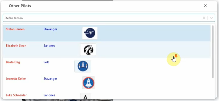
Searchable
Use the Searchable property to enable or disable searching the dropdown items. The default value is false.
Example
<UI Grid="grid">
    <Dropdown Row="1" Column="1" ColumnSpan="6" Searchable="true" ItemsSource="Pilots" DisplayMember="Name" ValueMember="PilotID" SelectedValue="{Binding Path:Pilot.PilotID}" ItemSelected="OnItemSelected">
         <ItemTemplate>
            <Layout CssClass="dropdownItemTemplateContainer">
                <Grid Columns="150px auto 100px" Gap="4">
                    <Label Text="{Binding Path:Name}" Column="1" CssClass="text" />
                    <Label Text="{Binding Path:Address}" Column="2" CssClass="text2" />
                    <Image Source="{Binding Path:LogoUrl}" Column="4" CssClass="image"/>
                </Grid>
            </Layout>
        </ItemTemplate>
    </Dropdown>
</UI>
Hotkey
Specifies the hotkey for the control.
Example
<Input Hotkey="Alt+D"/>

StopClickEventPropagation
Stops the click event from propagating up the DOM tree.
<Dropdown Row="1" Column="1" ColumnSpan="6" Searchable="true" ItemsSource="Pilots" DisplayMember="Name" ValueMember="PilotID" SelectedValue="{Binding Path:Pilot.PilotID}" ItemSelected="OnItemSelected" stopClickEventPropagation="true">