SplitButton
Inherits from Text Control.
Property:
Click
Specifies the name of the Function to call when the user clicks the SplitButton.
Example
<SplitButton Name="SplitButton1" Text="Click me" Click="ShowAlert"/>
This example shows how to call a function when the SplitButton is clicked, passing an argument.
<SplitButton Name="SplitButton1" Text="Click me" Click="ShowAlert('My message')"/>
Disabled
Use the Disabled property to disable a control or set it to read-only.
The disabled property support data binding or an explicit value (true, false).
Example
<SplitButton Disabled="{Binding Path:Customer.NotActive}"/>
or
<SplitButton Disabled="true"/>
You cannot use both a Binding AND the control APIs at the same time to set the disabled state of a control.
If the Disabled property of a control has a Binding, using the control.Disable() or control.Enable() APIs will not work (binding will win).
Valid values for the Disabled property:
- True
- False
- {Binding}
StopClickEventPropagation
Stops the click event from propagating up the DOM tree.
Type
Specifies the default look of the button. Valid values are "Default", "Primary", "Secondary", "Confirm"
Items
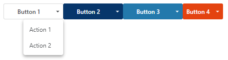
To specify a collection of sub-actions in a SplitButton, add one or more SplitButtonItem objects as children of the SplitButton.
        <SplitButton Text="Button 1" Click="SplitStuff()" Type="Default" >
        	<SplitButtonItem Text="Action 1" Click="SplitItem1()"/>
        	<SplitButtonItem Text="Action 2" Click="SplitItem2()"/>
        </SplitButton>
ItemsSource
Optional. Specifies the name or binding to an array containing data items which is used to render a dynamic number of sub items.
Note
You need to specify the SplitButtonItemTemplate.
ItemsSourceFilter
Optional. Specifies a function that returns the items that is used to render the SplitButtonItems created from the ItemsSource. The function cannot be asynchronous.
SplitButtonItemTemplate
Optional. Specifies the item template for the SplitButton sub items when using ItemsSource. If the SplitButton contains both fixed SplitButtonItems and a SplitButtonItemTemplate, the fixed items will be rendered first.
Example
This example shows how to use the ItemsSource, ItemsSourceFilter and SplitButtonItemTemplate to render a dynamic number of sub items in the SplitButton.
<Functions>
      <Function Name="send">
          alert('send clicked');
      </Function>
      <Function Name="onClick" Parameters="dataItem">
          alert(`SplitButtonItem ${dataItem.id} was clicked');
      </Function>
      <Function Name="itemsFilter" Parameters="items">
          return items.filter(f => f.id == 'a' || f.id == 'b' );
      </Function>
  </Functions>
  <EventHandlers>
      <FormEventHandler On="Init">
          this.addViewStateModel("Actions", {
               splitButtons:[{
                  text: "Subaction 1",
                  id:"a"
               },{
                   text: "Subaction 2",
                   id:"b"
               }
               ]
          });
      </FormEventHandler>
  </EventHandlers>
  <UI Grid="grid">
      <Grid Rows="auto 1fr" Columns="200px 200px 1fr">
          <SplitButton Text="Send" ItemsSource="{Binding Path:ViewState.Actions.splitButtons}" ItemsSourceFilter="itemsFilter" Click="send">
              <SplitButtonItemTemplate Text="{Binding Path:text}" Click="onClick($Data)"/>
          </SplitButton>
      </Grid>
  </UI>
Hotkey
Specifies the hotkey for the control.
Example
<Input Hotkey="Alt+B"/>
