Charts Formatting
General pie chart properties
Data Source
Specifies the source of the data set.
Name Value
Specifies the Name Value.
Serie Name
Specifies the name of the Series.
Serie Colors
A series specific or series type specyfic color set to use instead of the global colors.
Data Labels Enabled
Enable or disable the data labels.
Data Labels Format
A format string for the data label. Available variables are the same as for [ formatter ].
Data Labels Formatter
Callback JavaScript function to format the data label.
Note
If a [ format ] is defined, the format takes precedence and the formatter is ignored. Available data are:
[ this.centage ]
Stacked series and pies only. The point's percentage of the total.
[ this.point ]
The point object. The point name, if defined, is available through [ this.point.name ].
[ this.series ]:
The series object. The series name is available through [ this.series.name ].
[ this.total ]
Stacked series only. The total value at this point's x value.
[ this.x ]
The x value.
[ this.y ]
The y value.
Tooltip Point Format
The HTML of the point's line in the tooltip. Variables are enclosed by curly brackets. Available variables are point.x, point.y, series.name and series.color and other properties on the same form. Furthermore, point.y can be extended by the [ tooltip.yPrefix ] and [ tooltip.ySuffix ] variables. This can also be overridden for each series, which makes it a good hook for displaying units.
Tooltip Point Formatter
A callback function for formatting the HTML output for a single point in the tooltip. Like the pointFormat string, but with more flexibility. The [this] keyword refers to the Point object.
Tooltip Date Time Label Formats
For series on a datetime axes, the date format in the tooltip's header will by default be guessed based on the closest data points. This member gives the default string representations used for each unit. For an overview of the replacement codes, see
<a href=#Highcharts.dateFormat>dateFormat</a>.
Defaults to:
       {
            millisecond:%A, %b %e, %H:%M:%S.%L,
            second:%A, %b %e, %H:%M:%S,
            minute:%A, %b %e, %H:%M,
            hour:%A, %b %e, %H:%M,
            day:%A, %b %e, %Y,
            week:Week from %A, %b %e, %Y,
            month:%B %Y,
            year:%Y
        }
Tooltip Value Decimals
How many decimals to show in each series' y value. This is overridable in each series' tooltip options object. The default is to preserve all decimals.
Tooltip XDate Format
The format for the date in the tooltip header if the X axis is a datetime axis. The default is a best guess based on the smallest distance between points in the chart.
X Axis
When using dual or multiple x axes, this number defines which xAxis the particular series is connected to. It refers to either the
<a href=#xAxis.id>axis id</a>
or the index of the axis in the xAxis array, with 0 being the first.
Y Axis
When using dual or multiple y axes, this number defines which yAxis the particular series is connected to. It refers to either the
<a href=#yAxis.id>axis id</a>
or the index of the axis in the yAxis array, with 0 being the first.
Data Point Factory
Function name (on the form func::my.lib.func) or function expression used for creating a Data Point for a serie. An object on the form {pointData, row, serieName} is passed to the function.
The pointData is the point data object already created by InVision, which you can modify in this function by changing its fields and adding new ones.
The row is the actual data row from the Data Source that the pointData object was created from.
The serieName is the name of the serie.
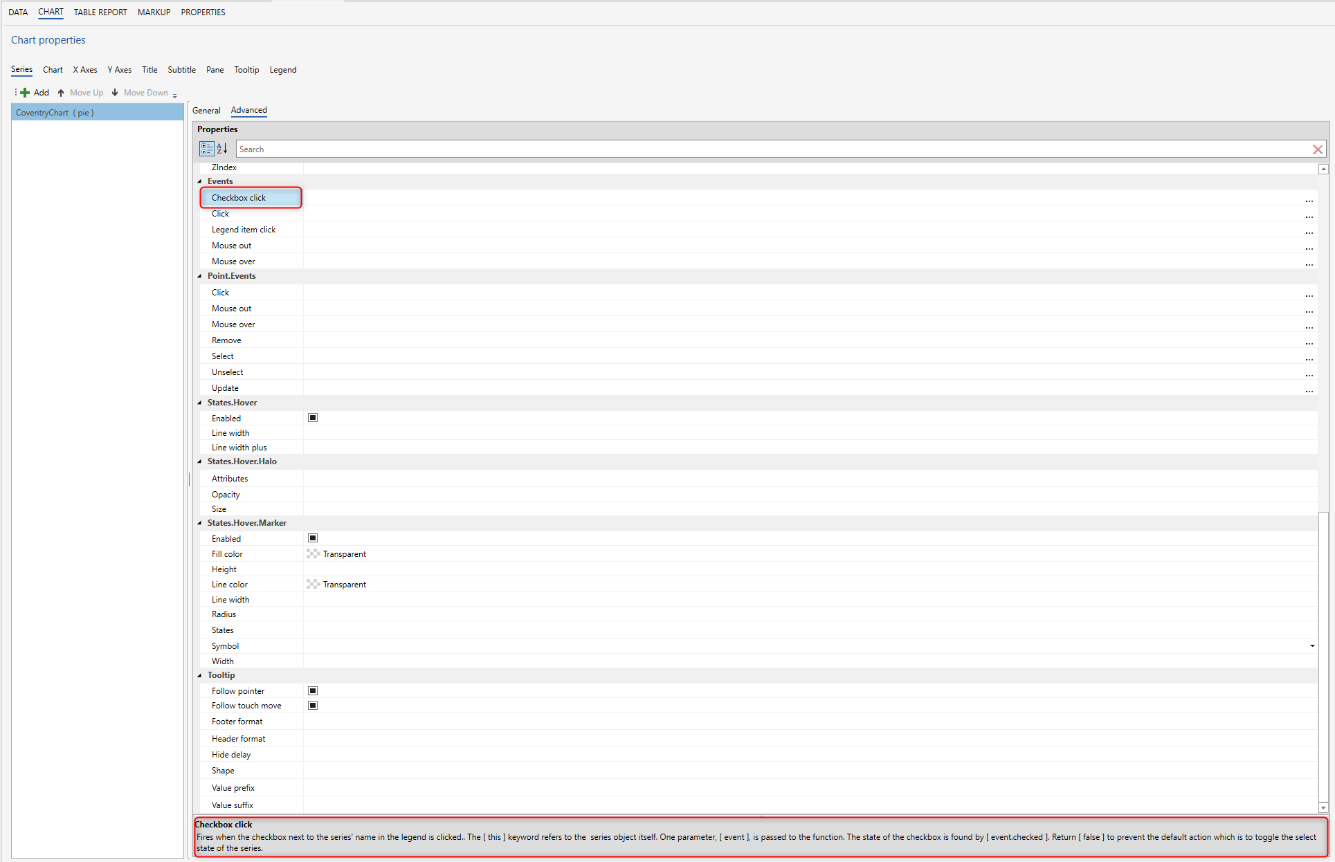
Advanced pie chart properties
Allow point select
Allow this series' points to be selected by clicking on the markers, bars or pie slices.
Animation
Enable or disable the initial animation when a series is displayed. The animation can also be set as a configuration object.
Note
This option applies only to the initial animation of the series itself. For other animations, see <a href=#chart.animation>chart.animation</a> and the animation parameter under the API methods.
The following properties are supported:
    <dl>
        <dt>duration</dt>
        <dd>The duration of the animation in milliseconds.</dd>
        <dt>easing</dt>
        <dd>When using jQuery as the general framework, the easing can be set to [ linear ]
        or	[ swing ]. More easing functions are available with the use of jQuery plug-ins, most notably the jQuery UI suite.
        See <a href=http://api.jquery.com/animate/>the jQuery docs</a>. When using MooTools as the general framework, use the property name [ transition ] instead of [ easing ].</dd>
    </dl>
Due to poor performance, animation is disabled in old IE browsers for column charts and polar charts.
Border color
The color of the border surrounding each slice.
Border width
The width of the border surrounding each slice.
Center
The center of the pie chart relative to the plot area. Can be percentages or pixel values. The default behaviour (as of 3.0) is to center the pie so that all slices and data labels are within the plot area. As a consequence, the pie may actually jump around in a chart with dynamic values, as the data labels move. In that case, the center should be explicitly set, for example to [ [50%, 50%] ].
Cursor
You can set the cursor to pointer if you have click events attached to the series, to signal to the user that the points and lines can be clicked.
Enable mouse tracking
Enable or disable the mouse tracking for a specific series. This includes point tooltips and click events on graphs and points. For large datasets it improves performance.
End angle
The end angle of the pie in degrees where 0 is top and 90 is right. Defaults to [ startAngle ] plus 360.
Ignore hidden point
Equivalent to
<a href=#chart.ignoreHiddenSeries>chart.ignoreHiddenSeries</a>, this option tells whether the series shall be redrawn as if the hidden point were [ null ]. The default value changed from [ false ] to [ true ] with Highcharts 3.0.
Inner size
The size of the inner diameter for the pie. A size greater than 0 renders a donut chart. Can be a percentage or pixel value. Percentages are relative to the size of the plot area. Pixel values are given as integers.
Linked to
The
<a href=#series.id>id</a>of another series to link to. Additionally, the value can be :previous to link to the previous series. When two series are linked, only the first one appears in the legend. Toggling the visibility of this also toggles the linked series.
Min size
The minimum size for a pie in response to auto margins. The pie will try to shrink to make room for data labels in side the plot area, but only to this size.
Selected
Whether to select the series initially. If [ showCheckbox ] is true, the checkbox next to the series name will be checked for a selected series.
Shadow
Whether to apply a drop shadow to the plot area. Requires that plotBackgroundColor be set. Since 2.3 the shadow can be an object configuration containing [ color ], [ offsetX ], [ offsetY ], [ opacity ] and [ width ].
Show in legend
Whether to display this particular series or series type in the legend. The default value is [ true ] for standalone series, [ false ] for linked series.
Size
The diameter of the pie relative to the plot area. Can be a percentage or pixel value. Pixel values are given as integers. The default behaviour (as of 3.0) is to scale to the plot area and give room for data labels within the plot area. As a consequence, the size of the pie may vary when points are updated and data labels more around. In that case it is best to set a fixed value, for example [ 75% ].
Sliced offset
If a point is sliced, moved out from the center, how many pixels should it be moved?
Start angle
The start angle of the pie slices in degrees where 0 is top and 90 right.
Sticky tracking
Sticky tracking of mouse events. When true, the [ mouseOut ] event on a series isn't triggered until the mouse moves over another series, or out of the plot area. When false, the [ mouseOut ] event on a series is triggered when the mouse leaves the area around the series' graph or markers. This also implies the tooltip. When [ stickyTracking ] is false and [ tooltip.shared ] is false, the tooltip will be hidden when moving the mouse between series. Defaults to true for line and area type series, but to false for columns, pies etc.
Index
The index of the series in the chart, affecting the internal index in the [ chart.series ] array, the visible Z index as well as the order in the legend.
Legend index
The sequential index of the series in the legend.
<div class=demo>
//Try it:
<a href=http://jsfiddle.net/gh/get/jquery/1.7.1/highslide-software/highcharts.com/tree/master/samples/highcharts/series/legendindex/ target=_blank>
Legend in opposite order</a> </div>.
Stack
This option allows grouping series in a stacked chart. The stack option can be a string or a number or anything else, as long as the grouped series' stack options match each other.
Here is just couple of options. By clinking on a property in the InVision designer, you will find describtion below.