InVision 2022.3 change log - part 2
New Features & fixes
Spreadsheets (Worksheets + Tables)
Conditions for Context Menu Options
You can now specify conditions for whether a context menu option should be available to the user or not. That enables context menus to be rendered dynamically based on information from the clicked row(s) and the state of the Workbook.
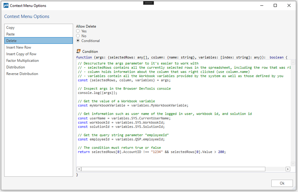
Use JavaScript to define conditions to whether a context menu option should be available or not.
Read more about conditions for standard context menu options here
Read more about conditions for custom context menu actions
Table View
You can now turn off the selection column
This is useful if you want to save space, and only have a single select enabled.
Dropdown menus auto sizes to the content width
This prevents horizontal scrolling in the dropdown menus of filters.
Bug fixes
Fixed issue regarding null values in selector filters. This fixed a crash if your data source contained NULL in one of the columns having a dropdown filter.
Fixed issue with sorting of date columns. Dates were not sorted correctly.
Fixed issue with sorting of text columns where text was sorted using alphanumerical comparison instead of string comparison.
Fixed issues with missing Norwegian translations.
Fixed issue where scrolled text content was displayed underneath pinned left or right columns.
Fixed issue where client-side filters did not properly reset after a data reload.
Fixed issue where the row popdown menu was misplaced Changed checkbox filters to support tri-state (true, false, and null) for boolean fields.
Forms
ItemsSourceFilter API
The Listbox, Dropdown, and SplitButton controls now support using a custom filter to select a subset of items from the ItemsSource. This is useful if you want to use the same data source for two or more list controls, but don’t want to display the same items.
Apply a filter to the ItemsSource using the ItemsSourceFilter attribute
<Form>
  <Data>
    <Models>
      <Model Name="Customer" Source="@Object[Customers].DbObjectName" Fields="ID,Name" />
    </Models>
    <Lists>
    	<List Name="Customers" Source="@Object[Customers].DbObjectName" Fields="ID,Name"/>
    </Lists>
  </Data>
  <Functions>
  	<Function Name="MyFilter" Parameters="items, controlName">
  		return items.filter(item => item.ID !== "Customer1");
  	</Function>
  </Functions>
  <UI Grid="ui-root">
    <Listbox Name="MyListbox" Row="1"
    	MinWidth="100px"
        ItemsSource="Customers"
        ItemsSourceFilter="MyFilter($Data, $Ctrl.Id)"
    	DisplayMember="Name"
    	ValueMember="ID"
    	SelectedValue="{Binding Path:Customer.ID}" />
  </UI>
</Form>
Data Binding API
Solution Developers can use the new Data Binding API to retrieve all data bindings associated with a data source and force the binding targets (UI elements) to re-render.
A typical use case for this feature is when multiple lists or selection controls (for example dropdowns) are data bound to the same data source, and you are using the new ItemsSourceFilter feature to ensure that the same items are not available as selectable options in any two list controls.
Selection
Listbox now supports SelectedItemCssClass, which enables Solution Developers to specify a custom CSS class to apply to the selected item in the listbox.
If SelectedValue is data bound, the corresponding listbox item will be highlighted. The default style of the selected item can be overridden by the SelectedItemCssClass property.
<Form>
  <Style>
    <Css><![CDATA[
    .selectedItem{
    	background-color: #404040;
        color: white;
    }
]]></Css>
    <Layouts>
      <Grid Name="ui-root" Rows="200px 1fr" Columns="auto 1fr" />
    </Layouts>
  </Style>
  <Data>
    <Models>
      <Model Name="Customer" Source="@Object[Customers].DbObjectName" Fields="ID,Name" />
    </Models>
    <Lists>
    	<List Name="Customers" Source="@Object[Customers].DbObjectName" Fields="ID,Name"/>
    </Lists>
  </Data>
  <UI Grid="ui-root">
    <Listbox Name="MyListbox" Row="1"
    	MinWidth="100px"
        ItemsSource="Customers"
    	DisplayMember="Name"
    	ValueMember="ID"
    	SelectedItemCssClass="selectedItem"
    	SelectedValue="{Binding Path:Customer.ID}" />
  </UI>
</Form>
Listbox using SelectedItemCssClass to apply a custom style to the selected item.
$Ctrl keyword
The new $Ctrl keyword provides information about the current UI control, such as its Id. If you don’t specify a Name for the control, it will get an auto generated id. This feature is useful in ItemTemplates where you cannot use the Name property to identify the control. A typical use case is when you have dropdowns in a listbox, and you need to track the selection of each dropdown.
// Use $Ctrl.Id to pass the (auto generated) id of the control to the ItemSelected handler
<Dropdown ItemSelected="onItemSelected($Data, $Ctrl.Id)"/>
Dynamic number of SplitButton sub-items
The SplitButton control now supports dynamically adding and removing sub-items (SplitButtonItems) based on data in a data source, for example, a list. This enables having SplitButtons with a dynamic number of sub-actions based on the state in the Form Schema.
<Functions>
  	<Function Name="send">
  		alert('send');
  	</Function>
  	<Function Name="onClick" Parameters="data">
  		alert(data.id);
  	</Function>
  	<Function Name="filter" Parameters="items">
  		return items.filter(f => f.id == 'a' || f.id == 'b' );
  	</Function>
  </Functions>
  <EventHandlers>
  	<FormEventHandler On="Init">
  		this.addViewStateModel("Actions", {
  		 	splitButtons:[{
  		 	   text: "Subaction 1",
  		 	   id:"a"
	  		 },{
	  		 	text: "Subaction 2",
	  		 	id:"b"
	  		 }
  		 	]
  		});
  	</FormEventHandler>
  </EventHandlers>
  <UI Grid="grid">
  	<Grid Rows="auto 1fr" Columns="200px 200px 1fr">
  		<SplitButton Text="Send" ItemsSource="{Binding Path:ViewState.Actions.splitButtons}" ItemsSourceFilter="filter" Click="send">
  			<SplitButtonItemTemplate Text="{Binding Path:text}" Click="onClick($Data)"/>
  		</SplitButton>
  	</Grid>
  </UI>
Misc
- The Listbox, Dropdown, and TreeView control now supports Grid as the ItemTemplate container.
- We added support for handling Unload of a Form Schema from the DOM. Developers can use this event to do various types of cleanup.
Work Process
Access control on Work Process contents
We have added an option to restrict access to Work Process contents to Process administrators only. That makes all Workbooks in the Work Process unavailable to users that are not Process Administrators, even though they have been granted access through the Workbook Permissions Manager.
Note
that Process Administrators must still be granted regular access through the Workbook Permissions Manager in addition to being a Process Administrator to get exclusive access.
Work Process Deleted event
Solution Developers can now subscribe to a “Work Process Deleted” event which is from the Work Process Editor component when a Work Process has been deleted. That enables performing actions after a Work Process has been deleted, such as custom cleanup.
Misc
The web application has been updated to React 18 and the latest npm libraries. The most notable effect for end users is that the cold start loading time is improved.
When exporting a Package, the package version is automatically added to the file name.
Tab Control now has support for Large and Default modes. When using the Large mode, the tabs are displayed with larger text.
Tab Control now has support for controlling whether or not borders should be displayed.
We added support for translations of dimension names. You can use a text code to use the built-in translation system in InVision, or use the @Object[…].Lookup[] feature to roll your own.
Breaking changes
- The Transaction Pipeline Producer will now include wildcard matches in addition to exact matches when resolving which transaction to generate from the rule set. This may cause more transactions to be generated from the Transaction Pipeline after upgrading to 2022.3 (depending on how the rule set table has been set up).
See discussion here:
https://support.profitbase.com/platform/invision-beta/-/issues/536
See Also
- Change Log 2025.4
- Change Log 2025.3
- Change Log 2025.2
- Change Log 2025.1
- Change Log 2024.4
- Change Log 2024.3
- Change Log 2024.2
- Change Log 2024.1
- Change Log 2023.7
- Change Log 2023.6
- Change Log 2023.5
- Change Log 2023.4
- Change Log 2023.3
- Change Log 2023.2
- Change Log 2023.1
- Change Log 2022.5
- Change Log 2022.4
- Change Log 2022.3 pt 2
- Change Log 2022.3 pt 1
- Change Log 2022.1
- Change Log 5.2
- Change Log 5.1
- Change Log 5.0
- Change Log 4.1
- Change Log 4.0