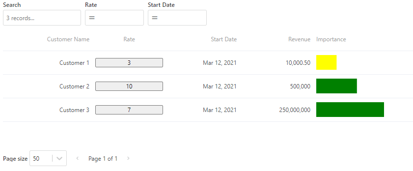
Table View
Table View is used for displaying data in a read-only data grid. Compared to spreadsheet tables (Worksheet, Table, and SQL Report) which are used for editing data, Table View is used for displaying data in a nicely formatted way.
The component has built-in features for selection, sorting, filtering, formatting, and custom renderers.
How to create a Table View object
Actions
Load Data
Call this action to load or refresh the data displayed in the Table View component. By default, this will load data from the InVision data model based on the TableView configuration (SQL query). If, however, you want to load data to the Table View using Flow instead, you can call UseFlow(...) in Load Data instructions.
Read more about calling UseFlow here.
Events
Cell Action Link Tapped
This event is raised when the user clicks a cell in an Action Link column. The event args has the following format:
Event args format
{
    "Data": {
        "Property1": "",
        "Property2": "",
        …
    },
    "Sender": {
        "ColumnName": "name of the column of the clicked cell",
        "ActionName": "ActionLink"
    },
    "Selection": {
        "Rows": [],
        "Cells": []
    }
}
Note
The Data property contains the fields and values of the clicked row, meaning the Data object will have different formats for every Table View, depending on how the query is defined.
Example
The example below shows how to use the Event args in an action handler
// Get the customer id of the clicked row
_state.customerId = Event.Data.CustomerId;

// Check which column was clicked
_state.columnClicked = Event.Sender.ColumnName;
Custom Context Menu Action Executed
This event is raised when a user clicks a context menu item. The event args has the following format:
Event args
{
    "Data": {
        "Property1": "",
        "Property2": "",
        …
    },
    "Sender": {
        "ColumnName": "name of the column of the clicked cell",
        "ActionName": "name of the context menu item action"
    },
    "Selection": {
        "Rows": [
            {
                "RowData": {
                    "Property1": "",
                    "Property2": "",
                    …
                },
                "Columns": [
                    "Property1",
                    "Property2",
                    …
                ]
            }
        ],
        "Cells": [
            {
                "RowData": "cell value",
                "Column": "Property1"
            },
            {
                "RowData": "cell value",
                "Column": "Property2"
            },
        ]
    }
}
Note
The Data property contains the fields and values of the clicked row. The Selection property contains the fields and values of the currently selected rows. These objects will be different for each Table View instance, depending on how the data source is defined.
The example below shows how to use the Event args in an action handler
Custom
This event can be raised from custom renderers, for example if you render clickable content in cells. The Event args contains a Data object which is sent from the renderer.
Example
The custom renderer raises a custom event passing an object with a key and value property.
function(eventArgs, services){
    btn.onclick = () => services.eventDispatcher.raiseCustomEvent({key: 'hello', value: 'world'});
}
The Event args will contain the following data:
{
    Data: {
        key: "hello",
        value: "world"
     }
}
Selection Changed
This event is raised when the row selection is changed by the user, for example when a user selects or deselects a row. The Event args contains data with the following format:
Event args
{
    "Data": {
        "SelectedItems": [{
                "Property1": "",
                "Property2": "",
            }
        ],
        "ChangedItems": [{
                "Property1": "",
                "Property2": ""
            }
        ],
        "Action": "select” | “deselect"
    }
}
Note
The “Data.SelectedItems and Data.ChangedItems” objects contain the fields and values of the clicked selected rows, so it will be different for each Table View instance, depending on how the data source is defined.
The Action property specifies whether the user selected or deselected a row. Valid values are select and deselect.
The SelectedItems contains the currently selected items.
The ChangedItems contains the items which were affected by the last change (select or deselect).
The example below shows how to use the Event args in an action handler
// Loop the selected rows and summarize the amount field
let sum = 0
for(const row of Event.Data.SelectedItems){
    sum += row.amount;
}
Row Clicked
This event is raised when the user clicks on a row. The Event args contains data on the following format:
Event args
{
    "Data": {
        "RowData": {
            "Property1": "",
            "Property2": "",
             …
        },
        "SelectedItems": [{
                "Property1": "",
                "Property2": "",
            }
        ],
        "ChangedItems": [{
                "Property1": "",
                "Property2": ""
            }
        ],
    }
}
The RowData property is the row that was clicked.
The SelectedItems contains the items that are currently selected. Note! This does NOT include the clicked row if it was not alredy selected when the click occurred.
Note
The Data.RowData property contains the fields and values of the clicked row, so it will be different for each Table View instance, depending on how the data source is defined.