Trend - Planner 4
Applies to: ![]() Planner 4
Planner 4
Overview
This report shows the line graph over periods for all report lines enabled for trending. Report lines available for trending (selectable item to the right) is a subset of all report lines. The set enabled for trending is configured when defining the report lines.
To use this report:
- Make any selections and click Refresh-button to draw the report
- Click on the legends on the lower part to toggle on/off individual graph-lines
See an example of this report in picture below.
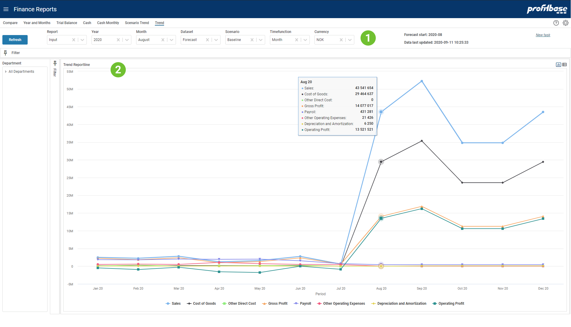
Top and Left Section
The left section contains the Department filter and gives the ability to slice data according to an organization hierarchy. The top sections contains mainly filter choices including selection of which report to presented. The upper right "Forecast start" tells which calendar period the forecast start. Since this may be a rolling forecast this period will be updated as the forecast reach next period. "Data last updated" tells when the input was last simulated to generate the full ledger. This process is normally scheduled to run at certain intervals.Content Section
The content section shows graph lines for all report lines that are configured enabled for trending. The Forecast dataset is composed of Actual data for periods before the Forecast start and Forecast input data from the Forecast start period (as shown in the upper right in the report).
Filter Descriptions
Filter selections available apart from Department are:
- Report
Allows for selecting between different report configurations - Year
What year to look at - Month
Not relevant for this report. - Dataset
Select dataset to trend. - Scenario
Select scenario "Baseline", "Best" or "Worst". Note that these are only relevant for Forecast and Budget datasets. - Timefunction
Selecting Month will show the numbers for each month. Selecting Year-to-date will show the sum of this and preceding periods. To see balanced you have to use Year-to-date. - Currency
Choose which currency to the used in the report. Average rate for each period is used for currency conversion.
Graph Descriptions
Each graph line represents a reporting line enabled for trending in the selected report. The amount is plotted on a per million scale. Moving the mouse over a period, will show a shared tooltip that present all amounts for the period.