Components
Components are the presentation elements that make up a KPI card. They are arranged in a row and
each renders some part of the card's data and its own resolved state. Each component can carry its
own optional DataSource and States: when a component leaves DataSource blank it falls back to
the card-level DataSource result, and each component resolves its own states independently (see
Data and states).
In the configuration XML, the element name equals the component name (for example <Metric />,
<StatusIndicator />). A component's DataSource and States are child elements; all other settings
are attributes.
Properties shared by all components
Every component supports HorizontalAlignment:
| Property | Allowed values |
|---|---|
HorizontalAlignment |
left, center, right. When omitted, the component flows at the start of the row (left) at its natural width; left, center, and right give it a cell that fills its share of the row and justifies its content accordingly. |
Components that display card data also bind to a result column. Numeric components read
ValueColumn; text components read TextColumn:
| Property | Allowed values |
|---|---|
ValueColumn |
The result column read as the value, overriding the resolved value. Used by Metric, TrendDirection, and TrendBadge — and by Chart, to pick a column of its own series result. The named column must exist in the result set. |
TextColumn |
The result column read as the text, overriding the resolved text. Used by Text and TrendText. The named column must exist in the result set. |
The purely state-driven components — StatusBlock, Image, and StatusIndicator — render
from their own resolved state and ignore ValueColumn / TextColumn.
The text components Metric and Text additionally support:
| Property | Allowed values |
|---|---|
Size |
sub, normal, heading1, heading2, heading3 |
Weight |
normal, semibold, bold |
Component reference
Metric
Displays the card's numeric value, formatted. Reads the resolved value (or its ValueColumn
override) and takes its color from its own resolved state.
| Property | Allowed values |
|---|---|
FormatString |
One of InVision's number format strings (numbro-style), for example 0,0, 0.[00], 0,0.00, 0%, 0a. When omitted, the value uses the locale's default number formatting. |
Size |
sub, normal, heading1, heading2, heading3. Defaults to heading1. |
Weight |
normal, semibold, bold. Defaults to semibold. |
HorizontalAlignment |
left, center, right |
ValueColumn |
a column name from the card's result set |
<Metric ValueColumn="Revenue" FormatString="0,0" Size="heading1" Weight="bold" HorizontalAlignment="center" />
Text
Displays a text value. Reads the resolved text (or its TextColumn override) and renders it as
text. Unlike the other components, Text has its own Color attribute rather than taking a
state color.
| Property | Allowed values |
|---|---|
Color |
Any CSS color — a named color (green, red) or a hex value (#333). |
Size |
sub, normal, heading1, heading2, heading3. Defaults to heading3. |
Weight |
normal, semibold, bold. Defaults to semibold. |
HorizontalAlignment |
left, center, right |
TextColumn |
a column name from the card's result set |
<Text TextColumn="Region" Color="#555" Size="sub" />
TrendText
Displays the card's text, colored by its own resolved state. Use it when you want the value itself to carry the state color. Its size and weight come from the card's type-scale class defaults and are not set on the component.
| Property | Allowed values |
|---|---|
HorizontalAlignment |
left, center, right |
TextColumn |
a column name from the card's result set |
<TrendText TextColumn="TrendSince" HorizontalAlignment="left" />
Chart
Renders a sparkline. The Chart's DataSource returns the whole series (one value per row) to plot,
rather than a single row. Unlike the scalar components, the Chart does not fall back to the
card-level DataSource — a blank DataSource yields no series — so each Chart on a card adds one
more query.
| Property | Allowed values |
|---|---|
DataSource |
A SQL query (child element) returning the series rows to plot. No card-level fallback. |
HorizontalAlignment |
left, center, right |
ValueColumn |
the column read from the DataSource series result |
<Chart ValueColumn="Amount">
  <DataSource><![CDATA[SELECT Amount FROM FactSales ORDER BY PeriodId]]></DataSource>
</Chart>
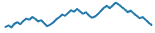
Example chart
TrendDirection
Shows an up or down arrow chosen purely from the sign of its value: a negative number shows the down arrow, anything else (zero, positive, non-numeric) shows the up arrow. The arrow colors are fixed in the icons and are not driven by state.
The two icons:
| Shown when | Icon |
|---|---|
| the value is zero or positive |  |
| the value is negative |  |
| Property | Allowed values |
|---|---|
HorizontalAlignment |
left, center, right |
ValueColumn |
a column name from the card's result set |
<TrendDirection ValueColumn="Trend" HorizontalAlignment="left" />
TrendBadge
Shows a trend badge — increase, decrease, or "same". The bound column must contain one of the
tokens increase, decrease, or same (matched case-insensitively); any other or empty value
renders no icon. The data source owns the threshold logic that decides which token to emit.
The badge per token:
| Token | Icon |
|---|---|
increase |
 |
decrease |
 |
same |
 |
| Property | Allowed values |
|---|---|
HorizontalAlignment |
left, center, right |
ValueColumn |
a column name from the card's result set; its value must be increase, decrease, or same |
<TrendBadge ValueColumn="TrendToken" HorizontalAlignment="left" />
StatusBlock
A solid colored block whose background color comes from its own resolved state Color. Use it as a
bold, text-free status indicator.
| Property | Allowed values |
|---|---|
HorizontalAlignment |
left, center, right |
<StatusBlock HorizontalAlignment="left">
  <States>
    <State>
      <Condition><![CDATA[NumericValue > 25]]></Condition>
      <Properties><Property Name="Color" Value="green" /></Properties>
    </State>
    <State>
      <Condition><![CDATA[NumericValue <= 25]]></Condition>
      <Properties><Property Name="Color" Value="red" /></Properties>
    </State>
  </States>
</StatusBlock>
| Description | Image |
|---|---|
With no resolved Color, the block renders in its default neutral fill |
 |
When a state resolves a Color, that color fills the block |
 |
Image
Displays the image from its own resolved state. The state's Image value is resolved through the
Image Library when it is an @images/<image-name>.png reference; a raw image URL is also
accepted.
| Property | Allowed values |
|---|---|
HorizontalAlignment |
left, center, right |
The image to show is set on the component's states, via an Image property. The value is usually
an Image Library reference of the form @images/<image-name>.png (for example @images/trend-up.png):
<Row>
  <Image HorizontalAlignment="center">
    <States>
      <State>
        <Condition><![CDATA[NumericValue > 25]]></Condition>
        <Properties><Property Name="Image" Value="@images/trend-up.png" /></Properties>
      </State>
      <State>
        <Condition><![CDATA[NumericValue <= 25]]></Condition>
        <Properties><Property Name="Image" Value="@images/trend-down.png" /></Properties>
      </State>
    </States>
  </Image>
</Row>
@images/ references an image stored in your solution's Image Library (web assets), which must
exist in the library to display. A raw image URL also works — any value that does not start with
@images is used as-is. Using an @images/ reference is recommended so the image travels with the
solution. See Data and states for the full
explanation, and the Button control for the same
@images/ convention elsewhere in InVision.
StatusIndicator
A status icon chosen from its own resolved state Status. Use it for a compact status indicator.
The icon is selected by the state's Status token — Complete, HalfWay, or Initial; if the
resolved state has no (or an unrecognized) Status, no icon is shown.
The icon per Status token:
| Status | Icon |
|---|---|
Complete |
 |
HalfWay |
 |
Initial |
 |
| Property | Allowed values |
|---|---|
HorizontalAlignment |
left, center, right |
<Row>
  <StatusIndicator>
    <States>
      <State>
        <Condition><![CDATA[NumericValue >= 100]]></Condition>
        <Properties><Property Name="Status" Value="Complete" /></Properties>
      </State>
      <State>
        <Condition><![CDATA[NumericValue >= 50]]></Condition>
        <Properties><Property Name="Status" Value="HalfWay" /></Properties>
      </State>
      <State>
        <Condition><![CDATA[NumericValue < 50]]></Condition>
        <Properties><Property Name="Status" Value="Initial" /></Properties>
      </State>
    </States>
  </StatusIndicator>
</Row>