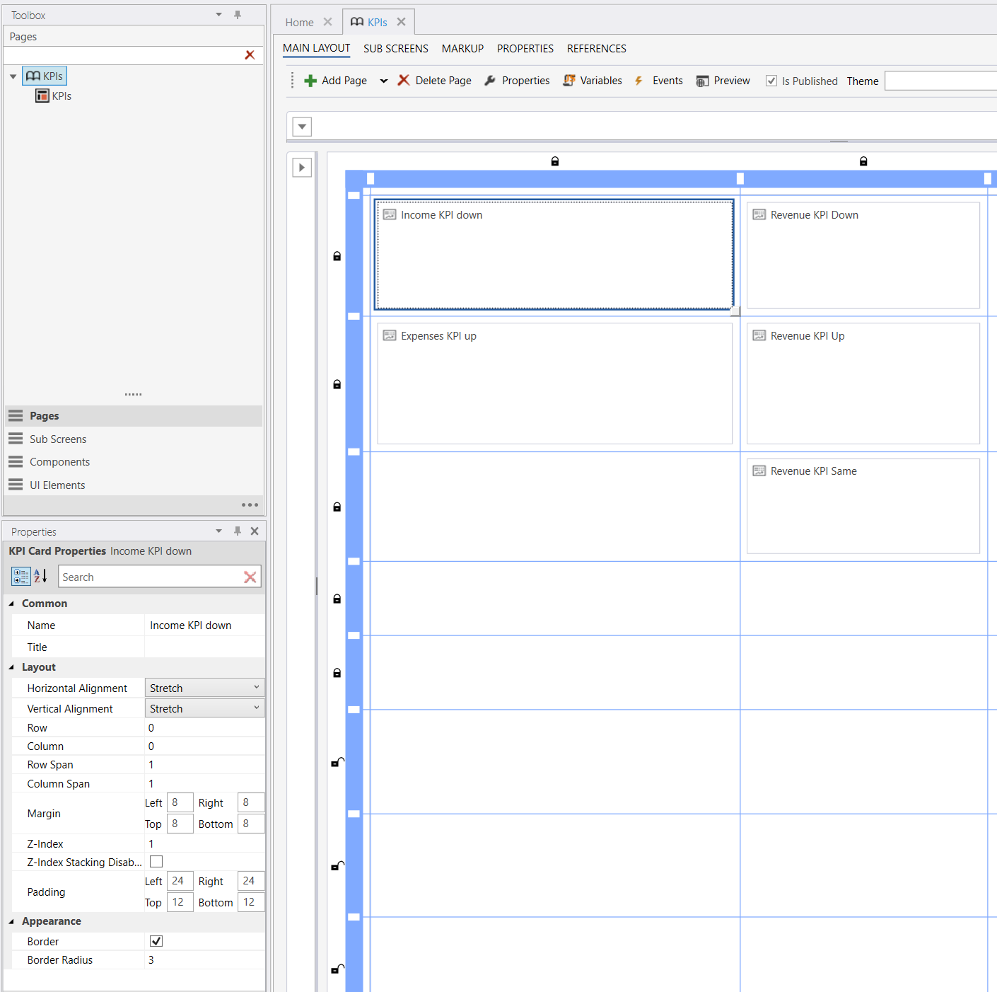
Creating KPI cards
This article walks through creating a KPI card in the Designer, setting its data source, placing it on a Workbook page, and styling it. For the data model and component details, see Data and states and Components.
Create a KPI card in the Designer
KPI cards are solution objects. Create one from the Solution Explorer the same way you create other objects, then open it to edit its configuration.
The card is edited as XML in the Designer — you author the card's KpiConfiguration directly:
its data source and the row of components, each with its own optional states. A new KPI card starts
from a default template that you edit to fit your needs — or you can replace it with one of the
starter templates below. A simple card looks like this:
<KpiConfiguration>
  <DataSource><![CDATA[SELECT SUM(Amount) AS NumericValue, 'Revenue YTD' AS TextValue FROM FactSales]]></DataSource>
  <Row>
    <Metric Size="heading1" Weight="bold">
      <States>
        <State>
          <Condition><![CDATA[NumericValue > 0]]></Condition>
          <Properties><Property Name="Color" Value="green" /></Properties>
        </State>
        <State>
          <Condition><![CDATA[NumericValue <= 0]]></Condition>
          <Properties><Property Name="Color" Value="red" /></Properties>
        </State>
      </States>
    </Metric>
    <StatusIndicator>
      <States>
        <State>
          <Condition><![CDATA[NumericValue > 0]]></Condition>
          <Properties><Property Name="Status" Value="Complete" /></Properties>
        </State>
        <State>
          <Condition><![CDATA[NumericValue <= 0]]></Condition>
          <Properties><Property Name="Status" Value="Initial" /></Properties>
        </State>
      </States>
    </StatusIndicator>
  </Row>
</KpiConfiguration>
From here you:
- set the card's data source,
- add, on each component, the states that drive its color, icon image, or status,
- add the components that present the data.
For the complete XML format, see the Developer reference.
Starter templates
The tool has no built-in design helpers, so the quickest way to build a card in one of the two
supported designs is to copy one of the configurations below into your card and adapt it —
swap the mock DataSource query for your own and rename the columns to match. Both templates use
inline VALUES data so they render immediately, before you connect a real query.
Default design
The default design (no ClassName): a title, a metric with a sparkline chart, and a trend direction
arrow with a caption.
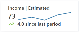
<KpiConfiguration>
  <DataSource><![CDATA[
SELECT
    'Income | Estimated' AS Title,
    (SELECT SUM(Amount) FROM (VALUES (1,10),(2,14),(3,9),(4,18),(5,22)) AS s(Id, Amount)) AS TotalIncome,
    4 AS Trend,
    '4.0 since last period' AS TrendSince;
]]></DataSource>
  <Row>
    <Text TextColumn="Title" />
  </Row>
  <Row>
    <Metric ValueColumn="TotalIncome" />
    <Chart ValueColumn="Amount">
      <DataSource><![CDATA[
SELECT Amount FROM (VALUES (1,10),(2,14),(3,9),(4,18),(5,22)) AS t(Id, Amount) ORDER BY Id
]]></DataSource>
    </Chart>
  </Row>
  <Row>
    <TrendDirection ValueColumn="Trend" />
    <Text TextColumn="TrendSince" />
  </Row>
</KpiConfiguration>
Status design (theme2)
The theme2 design: a title, a metric with a status icon and a trend badge, and a
muted caption. The StatusIndicator's own States evaluate TotalRevenue and drive its status icon.
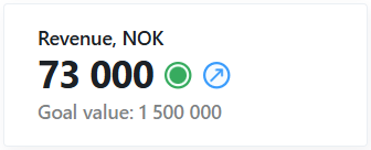
<KpiConfiguration ClassName="kpi-theme-theme2">
  <DataSource><![CDATA[
SELECT
    'Revenue, NOK' AS Title,
    (SELECT SUM(Amount) * 1000 FROM (VALUES (1,10),(2,14),(3,9),(4,18),(5,22)) AS s(Id, Amount)) AS TotalRevenue,
    'increase' AS Trend,
    'Goal value: 1 500 000' AS TrendSince
FROM (
    SELECT
        MAX(CASE WHEN rn = 1 THEN Amount END) AS Latest,
        MAX(CASE WHEN rn = 2 THEN Amount END) AS Previous
    FROM (
        SELECT Amount, ROW_NUMBER() OVER (ORDER BY Id DESC) AS rn
        FROM (VALUES (1,10),(2,14),(3,9),(4,18),(5,22)) AS t(Id, Amount)
    ) ordered
    WHERE rn <= 2
) last2;
]]></DataSource>
  <Row>
    <Text TextColumn="Title" />
  </Row>
  <Row>
    <Metric ValueColumn="TotalRevenue" />
    <StatusIndicator>
      <States>
        <State>
          <Condition><![CDATA[TotalRevenue >= 50000]]></Condition>
          <Properties><Property Name="Status" Value="Complete" /></Properties>
        </State>
        <State>
          <Condition><![CDATA[TotalRevenue > 10000 && TotalRevenue < 50000]]></Condition>
          <Properties><Property Name="Status" Value="HalfWay" /></Properties>
        </State>
        <State>
          <Condition><![CDATA[TotalRevenue <= 10000]]></Condition>
          <Properties><Property Name="Status" Value="Initial" /></Properties>
        </State>
      </States>
    </StatusIndicator>
    <TrendBadge ValueColumn="Trend" />
  </Row>
  <Row>
    <Text Color="#02080D80" TextColumn="TrendSince" />
  </Row>
</KpiConfiguration>
Set the card's data source
A KPI card has a card-level data source — a single SQL query that runs once and returns one row.
It is the default result for every component; a component can also declare its own DataSource to
read from a different query (see Data and states).
Edit the DataSource to return the value(s) you want to show. The query should return the metric in
a column named NumericValue and, optionally, a label in a column named TextValue:
SELECT SUM(Amount) AS NumericValue, 'Revenue YTD' AS TextValue FROM FactSales
You can return additional columns and reference them by name in a component's state conditions, or
point a component at a specific column with ValueColumn / TextColumn.
See Data and states for how columns are resolved.
Only the first row of the result set is used.
Choose a class (optional)
A card can opt into a type-scale style with the optional ClassName attribute on
<KpiConfiguration>. The value is a complete CSS class name applied verbatim to the card, which
sets the card's font sizes and weights. Two classes are built in — kpi-theme-theme1 and
kpi-theme-theme2 — and you can add your own to the stylesheet, reusing the predefined --kpi-*
variables. When omitted, the card defaults to kpi-theme-theme1.
<KpiConfiguration ClassName="kpi-theme-theme1">
  ...
</KpiConfiguration>
Add the card to a Workbook page
KPI cards are placed on Workbook pages as a page part. Add the KPI card page part to a page and select the KPI card you created. The card renders live in the Workbook, running its query and evaluating its states for the current user and filter context.
Wire up Load Data. Like every Workbook component, a KPI card does nothing until its interaction model is set up. The card will not load unless a Load Data action targets it from the Workbook page's events — the same page events used by Worksheets, Reports, and other components. If no Load Data action runs for the card, it renders empty.
Style the card
Card-level styling is set on the Workbook page part:
Border
Controls whether a border is drawn around the card. The border is enabled by default. To drive the border color from a condition, add a card-level
CardBorderelement whose state resolves aColor; this setting still controls whether the border is drawn at all.
Border Radius
The corner radius of the card, in pixels. Defaults to
3.
Padding
The inner spacing between the card edge and its content. Each side (left, top, right, bottom) can be set independently; the default is
24left,12top,24right,12bottom.
Within the card, each component's horizontal placement is controlled by its HorizontalAlignment
property (left, center, or right). See Components for per-component
properties.