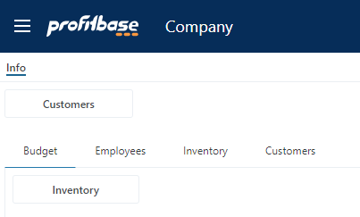
Tab Control

The Tab Control lets you organize content in tabs, and each tab can host a single Subscreen.
You can drag and drop a Tab Control onto a page from the UI Elements toolbox folder.
Events
| Name | Event args | Description |
|---|---|---|
| Selection Changed | Event.Data : { SelectedTabName : string, selectedTabName: string } | The Selection Change event is raised when the active / selected tab changes. |
Example - Using the Selection Changed event
When a tab is selected programatically or by the user, the Selection Changed event is raised. When handling the event, use the Event.Data.selectedTabName property to know which tab was selected.
this.app.ui.toasts.showInfo({title: 'Selected tab changed', message: Event.Data.selectedTabName});
Tab Items
To add Tabs, click Edit Tabs in the Property pane.
Using the Tabs editor, you can manage the tab items of your Tab Control by setting the header texts and contents.
To set the contents of a tab, choose a Subscreen from the Contents dropdown.
Note
Subscreen can only be used once, so if you don’t see a Subscreen in the dropdown, this means that it is already in use somewhere else in the Workbook.
Tab Item properties:
| Name | Description |
|---|---|
| Header | The text displayed in the tab header |
| Header expression | A C# expression returning the text to display as the tab header |
| Content | A Subscreen to display as the tab content. |
Tab Item API
You can use the Tabs API to control different states of the tabs dynamically, such as the header texts and enabled/disabled states.
The Tabs API can be called from the Execute Expression action of the Tab Control.
TabItem(...)
Call the TabItem(...) API in the Execute Expression action of the Tab Control.
It returns a reference to a Tab Item with the following API.
| Method name | Description | Example |
|---|---|---|
| SetHeader(text: string) | Sets the header of a tab item. | TabItem("MyTabName").SetHeader("Customers") |
| SetHeaderSuffix(text: string, whitespaceBetween: boolean = true) | Adds a suffix to the original tab item header. The optional whitespaceBetween enables you to determine whether you want whitespace between the base header text and the suffix (the default is true) | TabItem("MyTabName").SetHeaderSuffix("World") |
| ResetHeader() | Resets the header text to its original value | TabItem("MyTabName").ResetHeader() |
| Disable(disable: boolean = true) | Disables a tab item | TabItem("MyTabName").Disable() |
| Enable(enable: boolean = true) | Enables a tab item | TabItem("MyTabName").Enable() |
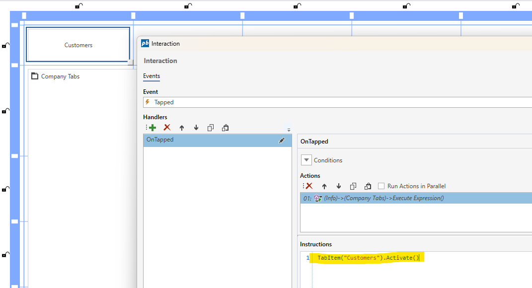
| Activate() | Activates (selects) a tab. | TabItem("MyTabName").Activate() |
Example: Change Tab when a button is clicked
The example below shows how to activate a tab when a Button is clicked.

