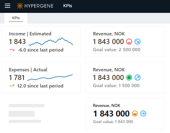
KPI Cards
A KPI card is a compact, data-driven dashboard element that turns a query result into a visual indicator — a metric, a sparkline, a trend indicator, a status indicator, a status block, an icon, or any combination of these.
KPI cards are designed and configured in the Designer, and rendered for end users on Workbook pages.
How a KPI card works
A KPI card is built from three things:
- A data source — a card-level SQL query that runs once and returns one row, used as the default result for every component. A component may also declare its own query.
- Per-component states (optional) — conditional rules carried by each component, where a condition-less rule always applies and the first matching condition overlays it, deciding that component's color, icon image, or status. A component may have no states at all.
- A row of presentation components — small visual elements (metric, text, sparkline, status indicator, status block, icon, etc.) that render the card's data and their own state.
The card-level query runs once as the shared default; a component with its own DataSource runs
an additional query (and the Chart sparkline always runs its own series query). Each component then
resolves its own state on the client — there is no single resolved state shared across the card.
A component chooses which result column to display (via ValueColumn / TextColumn) and applies
the color / image / status from its own matching state. The card's border color is driven by a
dedicated card-level CardBorder element.
By default a component shows the resolved value or text; a component can override which result
column it reads (via ValueColumn / TextColumn), and any column in the result set — plus the
reserved NumericValue / TextValue values — can be referenced by name in that
component's state conditions. See Data and states for the full model.
In this section
- Creating KPI cards — create a card in the Designer, set its data source, add it to a Workbook page, and style it.
- Data and states — the card-level data source, per-component data overrides, column resolution, and the per-component conditional states that drive each component's appearance.
- Components — reference for the nine presentation component types and the allowed values for every property.
- Developer reference — the XML configuration format, the data endpoint, import/export, and limits.